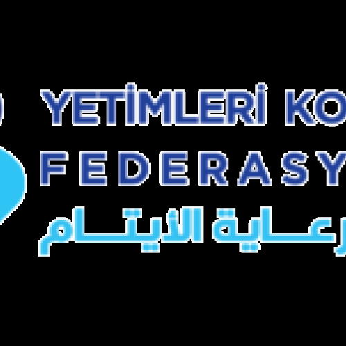
On the occasion of the advent of the blessed Eid Al-Adha, the Orphans Care Union will look with its new visual identity and suit The launch of the new logo is part of a study conducted to select the best standards for drawing new forms of identity and to establish the colors and shape of the logo in a way that reflects the vision and spirit of the work of the Union.
The Executive Director of the Federation, Mr. Fadi Iskandarani, confirmed by saying: “We aspire to increase the number of humanitarian charitable organizations to benefit from the services of the Federation, believing in the spirit of teamwork under one umbrella so that we can deliver our voice to international and global forums.” He added, “The task of the Federation at the current stage is to gain the trust of its members and work To provide the best services to them through networking and opening the door to building relationships with international and global institutions to contribute to developing the work of member organizations with partners and also through conducting studies and projects that serve the organizations and benefit the orphan and his family.”
“We are always looking for excellence.” With these words, Mr. Fadi Iskandarani concluded his talk about the launch of the new visual identity of the Orphan Care Union.
Proceeding from “Change begins with renewal” and in search of new ways of creativity to walk in clear steps in line with the objectives of the Union, its vision and the services it provides, we have implemented this new slogan to suit the current stage and reflect the reality of our work and be a beacon to us through which we achieve creativity.
The philosophy of the new logo: “Indications and Concepts.”
We designed the logo to be consistent and consistent with the name of the Orphan Care Union, inspired by the environment in which it operates, which is “orphans.” The identity was built on the following symbols: the
orphan, the mother (the sponsor) and the
orphan heart : is the essence of the work of the Union and the goal The foundation for which the union was established to provide the best services to him.
The mother (the sponsor): She is the one who takes care of the orphan after the loss of his father. The Union strives to provide programs in cooperation with all humanitarian organizations to help, support and motivate the widow and the mother of the orphan.
The heart: It is a symbol of tenderness and kindness that completes the image of an orphan with his sponsor.
Color: Blue and its shades were chosen because it represents the color of excellence, vitality, renewal, comfort and serenity. It usually symbolizes responsibility, trust and hope mixed with prosperity and stability.
In conclusion, the simplicity of the logo is a simulation of our current era, as it often requires that the logo be simple in the formation of its elements to achieve the desired goals. Simplicity helps the design to be multi-use, easy to understand, with clear significance and value. New Orphan Care Union.